Topic: How do you draw Fox Tails/ How to draw tails more fluffy?

Posted under Art Talk

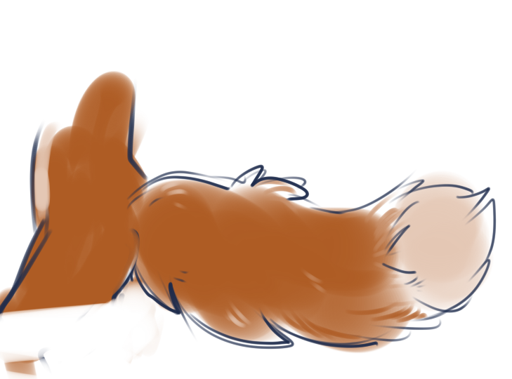
Recently finished doodle right here and realized something as I was looking over it.
post #1224161
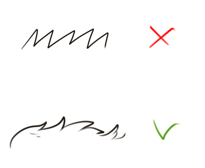
I have no clue how to draw a proper fox tail. ◠‿◠;)
You know, The once that look suuuuper fluffy and smooth and definitely don't look like they could poke someone in the eye T ‿T;)

Anyone know any good tips or references better than these
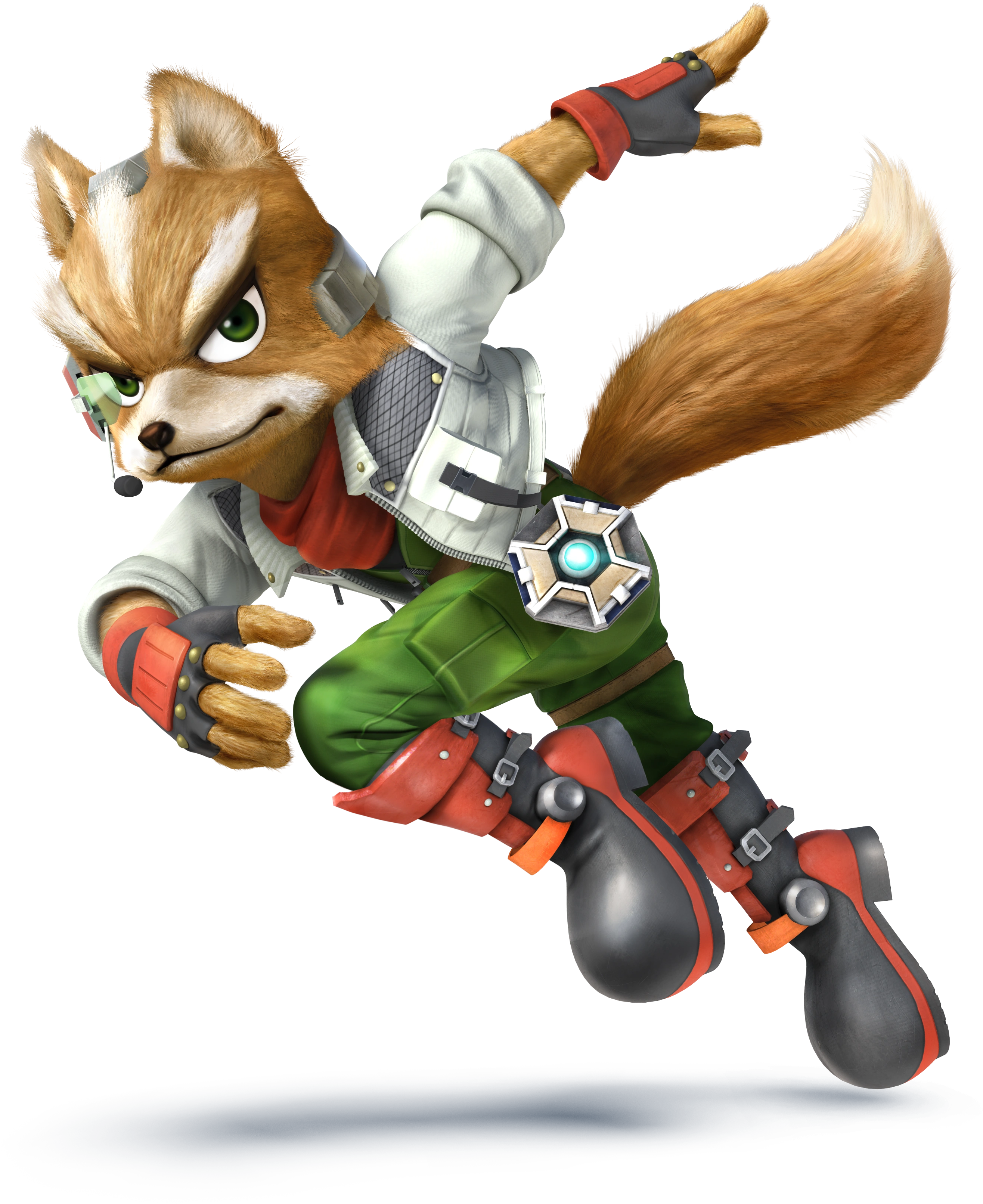
[Ones I used]: Fox & Sly The ones I use ~‿~)
for making the tail look more cushiony and plump in the middle like a fox's without having it come off more like a wolfs? ╹‿╹)

Updated by Ratte

the best action is to shameless copy other tails, until you can make them yourself.

as the old adage goes, "until you can do better, you copy".

Updated by anonymous

Well id advise copying from actual photos of real foxes or even better drawing on location from life(going to a zoo for example) if you are able. You won't learn anything from simply copying another artists art(your 2 links). You'll only end up imprinting their mistakes in your own art... you can reference other artists art but they are just that references, to study traits or style, compare, from to then embellish in your own style, they are not meant to be copied.

Also just so you know sly is a racoon if you wernt aware^^;

Updated by anonymous

Ruku said:
You won't learn anything from simply copying another artists art.

most artists would wish for the skills afforded to better artists; practice in itself is the desire to create something as good as what you look up to. i would never skip the opportunity to copy somebody who i deeply admire.

Updated by anonymous

dont make it sharp and tapered. make it more sausage shape. and add fluff.
like this

also avoid jagged zig-zag pattern while drawing fluff. add roundness and irregularities to make it look softer
like this

and finally, if you are going to draw a fox, look at photos of real foxes instead of other people's art of foxes.

Updated by anonymous

Wow, Got some pretty soil feedback and references.
I'm glad I made this thread lolz ╹‿╹)

fewrahuxo said:
the best action is to shameless copy other tails, until you can make them yourself.

as the old adage goes, "until you can do better, you copy".

Thanks man but I'm already out of the phase.
I mean there are definitely some more things I can learn from the style my art most relates too
but I'm in that phase of it where I'm creating my own style, My own name and all the jazz n_n
That part where your gotta have to learn the basics all over again and find a way to make it your own if that makes sense lolz ╹‿╹)

Ruku said:
Well id advise copying from actual photos of real foxes or even better drawing on location from life(going to a zoo for example) if you are able. You won't learn anything from simply copying another artists art(your 2 links). You'll only end up imprinting their mistakes in your own art... you can reference other artists art but they are just that references, to study traits or style, compare, from to then embellish in your own style, they are not meant to be copied.

Also just so you know sly is a racoon if you wernt aware^^;

TheHuskyK9 said:
Use real life references

Sadly I don't have any way of checking out a fox in real life. Cats in spades since my neighbors has tons and their adorable balls of fluff n///n but sadly no foxes ~ ~) You got a great point with the style and yeah I know he's a raccoon haha but the principles pretty much the same when it comes with the shape and fluffiness of his tail. Just his is slightly larger lolz ~ w ~)

Ledian said:
dont make it sharp and tapered. make it more sausage shape. and add fluff.
like this

also avoid jagged zig-zag pattern while drawing fluff. add roundness and irregularities to make it look softer
like this

and finally, if you are going to draw a fox, look at photos of real foxes instead of other people's art of foxes.

This Dood here, I just can't thank you enough ~ w ~)
Seriously with those refs I made massive improvements on my tails! (Imo ╹‿╹))

Alright, Thanks to all of you awesome peeps, This is what I have so far: https://image.prntscr.com/image/1e06ae706d58464495513ecccda8a2cb.png
Notes? ╹‿╹)

Updated by anonymous

Notkastar said:
Sadly I don't have any way of checking out a fox in real life. Cats in spades since my neighbors has tons and their adorable balls of fluff n///n but sadly no foxes ~ ~) You got a great point with the style and yeah I know he's a raccoon haha but the principles pretty much the same when it comes with the shape and fluffiness of his tail. Just his is slightly larger lolz ~ w ~)

No, I meant look at photos of real foxes

Updated by anonymous

There are plenty of photos of foxes out there as well as real fur tails sold at various stores. Fox tails generally have a rounded tip and thick fur that forms a very solid-looking outline, and the thicker the fur, the rounder the tip. Arctic fox tails are rounder than red fox tails which are rounder than fennecs who have pointy tails. Wolves, coyotes, and dogs have pointed tips to their tails and some individuals have a looser 'fringe' on the bottom.

As far as making the tails look 'fluffy' I see people make two mistakes frequently. One is treating animal tails like a pony-tail made of hair of different lengths- instead of the fur connecting to a core, it all connects to the root of the tail. The other mistake I see is not taking fur density/down/texture into account. Fluffy tails have thick, dense undercoats that prevent the guard hairs from laying flat against the tail. The thicker the undercoat, the less likely that the fur is going to clump, spread, and part. Some breeds of dog like the saluki don't have the same undercoat and comparing them to animals that do helps. You really need to look at photos of the real thing (or even better, examine real fur tails) to know how this will look on a specific breed/species.

Updated by anonymous

Notkastar said:
Wow, Got some pretty soil feedback and references.
I'm glad I made this thread lolz ╹‿╹)

Thanks man but I'm already out of the phase.
I mean there are definitely some more things I can learn from the style my art most relates too
but I'm in that phase of it where I'm creating my own style, My own name and all the jazz n_n
That part where your gotta have to learn the basics all over again and find a way to make it your own if that makes sense lolz ╹‿╹)

Sadly I don't have any way of checking out a fox in real life. Cats in spades since my neighbors has tons and their adorable balls of fluff n///n but sadly no foxes ~ ~) You got a great point with the style and yeah I know he's a raccoon haha but the principles pretty much the same when it comes with the shape and fluffiness of his tail. Just his is slightly larger lolz ~ w ~)

This Dood here, I just can't thank you enough ~ w ~)
Seriously with those refs I made massive improvements on my tails! (Imo ╹‿╹))

Alright, Thanks to all of you awesome peeps, This is what I have so far: https://image.prntscr.com/image/1e06ae706d58464495513ecccda8a2cb.png
Notes? ╹‿╹)

It's better, but you still tapered the end. It's understandable that there will be some pointage to it, but if you want to ensure it's especially foxlike, try it make the end like a pointed rabbit's tail, where it curves to the top and points there, rather than straight down the line.
It also helps that fox tails even have that white poof at the end as though it's a rabbit's tail on the end of a dog's tail.

Updated by anonymous

Here are some varying tail / butt shots I've drawn so you can make your own judgment whether I've got any room to talk:

post #1036621
post #1179129
post #1116398
post #1146150

In order to master fluffy tails like foxes have, you must master hair, as fluffy tails are essentially fleshy tentacles covered in a (literal?) buttload of hair.

While you can and should "draw from life", you should never think that more realistic is always necessarily better. An artist draws what he feels, not what he sees. Especially when learning, simplifying down to only the most visible details, and exaggerating those details, can significantly help in understanding and rendering the structure and expressive essence of your subject.

There are two basic properties to making hair look like hair:
- Offshoots
- Inconsistency

Offshoots are smaller tufts of hair that come off of a larger, groomed section. In your OP, the black wolf has these offshoots all over his person, while the fox has none. The offshoots must always follow the "flow" of the fur. In general, this is from the crown of the head straight down / back (interpreting the tail & legs as "down" from base / thighs to tip / toes), though "punk" characters such as your wolf occasionally have their head hair 'flow' up the back of their head.

Inconsistency (or imperfection, etc.) is a property of all natural objects. In this case, not only should the offshoots be irregularly sized and spaced, but the overall shape of hairy areas should never be mathematically smooth. Both the wolf's and fox's tails are smoothly curved bananas - while the wolf's offshoots help, it still looks rigid and unnatural, especially for the fox. I find that a wavy curve (S) works better for tails than a single curve. At the very least, I always slightly curl the very tip of hair or tails in the opposite direction of their overall curve. It just looks softer, lighter, and more natural.

Depending on the animal, the actual physical tail is longer or shorter relative to the hair. For instance, on a horse, the tail is very short but has incredibly long hair, so only the near-base of the visual tail can consciously be moved - the rest will hang down from that position. A fox, however, has shorter fur all down a long tail almost like a monkey, and can move the entire thing more dexterously, so it should be posed as such.

I find it works best for a fox's tail to gradually become thicker and fluffier until almost the very end, then taper very suddenly. This is what I did with Braixen up there, and how her tail looked in my references.

Good luck and keep drawing!

Updated by anonymous

Looking at the wolf's tail and etc, I would pick out this one thing that I think would help a lot with improving any fur you do:

You seem to be conceptualizing the form kind of like a cut out. On the wolf, the fur tufts are in plausible places, but they don't really have overlap or underlap shown, so they are kind of like spikes in overall feel.
I'd suggest this kind of exercise applied to studying photos of fur or RL fur. The point being just to follow the fur in and out and pick up the gestures in the surface, the ways they hang and push up against each other, the effect of gravity on them.
This is how I'd suggest studying. Drawing is a different matter. But once you have done study that gets the right facts in your mind, translating it into a finished drawing is fairly straightforward IMO.

What exact fur you study from doesn't really matter. Even studying hair gives most of the info you need (structurally, fur mostly just clumps more because it's so short)

Regarding rendering technique : line tapering is essential, AFAICS. Developing the ability to mentally extrude the form in the direction that the form is turning... helps with nicely light feeling endings, and in readably rendering areas where one form pushes over/through another.

This is a lesson I learnt from studying typography, and why I say line tapering is essential for fur: When two lines meet, their 'visual priority' (which form is 'in front') will be unclear unless the line weight differs.

Updated by anonymous

Clawdragons said:
Clearly the correct answer here is to draw it as a circle.

Lolz, A Real sucker for cute stuff like this ◠‿◠)

As for everyone else I can't think you enough for this fountain of advice and support and just interest in me improving as an artist. (Seriously it's heartwarming and a real source of encouragement recently ╹‿╹)

With a combination of all the tips, Exercise, Refs, and techniques you awesome doods have provided I was able to apply it my very first Custom Doodle! (commission!)

post #1226799

Know peeps probably moved on to the next thing but I still wanna ask anyway.
Notes? ◠‿╹)

Updated by anonymous

The fur on the lower arms and especially the tail is heading in the right direction. If you're working with vectors for the lines, you might be able to change the cap type (I don't remember your workflow, but I know Inkscape and Illustrator have cap types that taper to a sharp point.). At the risk of beating a dead horse, this tapering is especially necessary for those small overlaps. I notice you have begun to introduce more tapering, eg. right ear :)

The single fluff on the shoulderblade imo does not work. This is a general principle IME -- having just one of a thing draws attention to that thing, and I guess that isn't intended here. I'd suggest, either have 2+, or have none.

Hair flows well over the right ear. Not well over the left ear. Basically the form of the hair is ambiguous or contradictory on the left. The front edge of the ear is the biggest culprit -- it creates a tangent with one of the hair clumps. But the other part of it is that you have communicated an undulating tufty texture that is not carried through in the way the hair line pushes against the ear (currently, a plain arc. I would suggest a kind of accelerating wave, which I can draw if the phrase doesn't explain itself well.

In places, the airbrushing directly contradicts the statement of form made by the fur. The result is a metallic effect (eg. see fox's leg near centre bottom of pic). If possible, I would suggest brushing around the form rather than along it, with a brush set to vary size with pressure.

More internal fur would add to fluffiness. For example, look at wolf's left arm. It's all muscly, which means the surface will be turning a lot, coming in and out a lot. I said that a bit weirdly but hopefully you get it.. at those places where the surface rapidly drops off, fluff will often be evident.

Other tangents: fox arm has some nice overlaps, but then turns into a long stretch of exactly connected segments. This communicates a cut-out form (like a bat wing membrane, in this case IMO). Fox finger also creates a tangent with wolf hair fluff.

Updated by anonymous

Also that handwriting is really not terrible at all. It's pretty legible, just with a few consistency issues. Cranking down the brush size and the strength of the pressure->size mapping would improve it further IMO.

Updated by anonymous

Ratte

Former Staff

savageorange said:
Also that handwriting is really not terrible at all. It's pretty legible, just with a few consistency issues. Cranking down the brush size and the strength of the pressure->size mapping would improve it further IMO.

I've gotten complaints from teachers back in highschool over my handwriting, so I write + type stuff when I make little guides like these.

Updated by anonymous

  • 1