Topic: Art Review and Critique

Posted under Art Talk

Darkcelona said:
post #653839

Looks bueno to me :D The pose is cute, though I must admit that I'm not sure what she's embarrased about. Is it the bear she's holding? Or being caught bottomless? I'm not sure :V Regardless, I think it's well done!

Anyway, I don't see many glaring issues, but I do see many small things that could be good places to look into improving on in upcoming pieces.

Issues:

Her hair looks really stiff, almost like it's a cut out piece of cardboard. Doesn't help that both of her horns are somehow coming out of the back side of the hair? D: But I can't really fault you for the hair, it's hard, and I'm not very good at it either. Perhaps this could help though!

Her tail is the same width for almost the entire length, taper that shit! XD

Tips:

Anatomy and posing is something every artist should work on always. It in no means looks bad in this image, especially since it's more cartoonie, but always something to keep in mind. There are mmmaaannnyyy tutorials online

Your shading is effective, yet very simple. Time to get more complex! Begin thinking about light sources (where is the light coming from?) and cast shadows (what's obscuring that light?). For example, her tail has a shadow on it but it's not casting a shadow on her rump, nor is her shirt casting a shadow, plus she has no shadow beneath her feet, and there's no shading on her eyes. Lastly, if you want to take it a step further, you could even begin thinking about bounce/reflected light coming from other light sources like her tail fire, and also just in general on nice round things like breasts and rumps (they're easy, because they're practically spheres).

Her expression isn't bad, but it could definitely use a touch of refining as her mouth seems stiff and unexpressive. Perhaps try drawing some expressions just for practice? I know they're not anthros, but drawing human faces first will help you make anthro faces more expressive too

Drawing fire is really easy once you learn how to do it, and really fucking fun once you start to master it
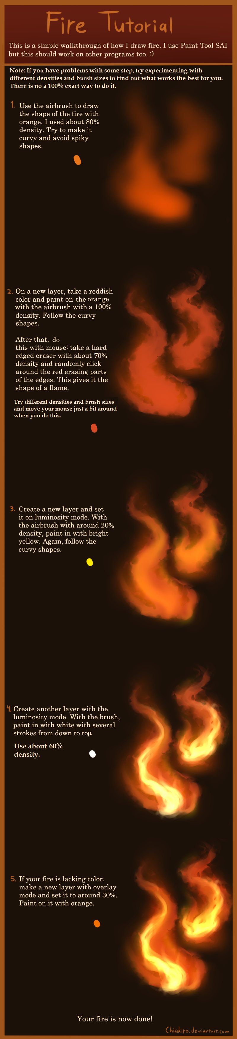
Awesome Things:

I don't think I said this earlier, but cudos on the much smaller logo :P

The character stands out well from the background. Good job on making her higher contrast and more saturated, it really makes her pop out.

Updated by anonymous

... The character stands out well from the background. Good job on making her higher contrast and more saturated, it really makes her pop out.

I know that many people would disagree, but personally I like it better when there is lower contrast and softer colors. I want the characters to look like they belong in the setting and not like they were cut out from a stencil and plastered into it. But I guess that in a more cartoonish style it's fine.

Updated by anonymous

Chessax said:
I know that many people would disagree, but personally I like it better when there is lower contrast and softer colors. I want the characters to look like they belong in the setting and not like they were cut out from a stencil and plastered into it. But I guess that in a more cartoonish style it's fine.

IME in general professionals choose less saturated colors, whether they are doing cartoons or not. Part of the reason is that stuff in reality really doesn't look that saturated generally, so you don't need to overstate things to make your character stand out. The other part is reflected light -- surfaces pick up color, particularly in shadowed areas, from their surroundings.

So in case it's not clear, I agree with you. The intense red on the socks, for example, feels like it's fighting for control over the picture with her hair, and would be better as a much lower saturation, darker red, IMO. It's good to limit the most intense colors for the things you want to draw a lot of attention to.. and if you look at pro work, you can see that they often achieve this with only tiny areas of intense color, with the rest duller to add to that emphasis.

IMO this is the important thing to consider -- not only for color, but contrast, line flow, focus, detail -- there are a lot of ways you can bring attention to something, or equally well, ways to make something seem unremarkable. It's important to decide what exactly you want to emphasize, so you can put the picture together in a way that best achieves that.

Updated by anonymous

Tokaido said:

Perhaps this could help though!

That is a really awesome and informative tutorial, thanks for sharing it. :)

Mod note: I fixed the link :P

Updated by anonymous

parasprite said:
That is a really awesome and informative tutorial, thanks for sharing it. :)

Mod note: I fixed the link :P

I just found it recently, isn't it awesome? :D I've been trying to up my game when it comes to hair recently.

haha, thanks XD

Updated by anonymous

Hi there ^_^ I'm current working to improve the overall composition of 3D art, experimenting with lighting, quadratic attenuation, luminosity levels and so on in Source Filmmaker, trying to find the best balance possible. In addition, I am also trying to experiment with different angles and perspectives, trying to convey it to the best of my abilities and as such, would appreciate any and all feedback, suggestions and tips. I know I'm not perfect at posing and what have you, but I want to improve and simply know what I need to do, and thank you for your time.

The images below are a project I am working on (and are quite NSFW), of a Lopbunny and dragon having a bit of fun.

The lopbunny model - https://sfmlab.com/item/340/
The dragon model - https://mega.co.nz/#!9N9knSID!BoYfUu4x72w2UmWOlhn_3Eh5R1eKbSHyqpwCJaluExA

Pictures in question:

Pose 1 http://sta.sh/0769djhfabd
Alt - http://tinyurl.com/o74tzrk

Pose 2 http://sta.sh/01l064i62twd
alt - http://tinyurl.com/o23m2eu

Updated by anonymous

fox_whisper85 said:
Hi there ^_^ I'm current working to improve the overall composition of 3D art, experimenting with lighting, quadratic attenuation, luminosity levels and so on in Source Filmmaker, trying to find the best balance possible. In addition, I am also trying to experiment with different angles and perspectives, trying to convey it to the best of my abilities and as such, would appreciate any and all feedback, suggestions and tips. I know I'm not perfect at posing and what have you, but I want to improve and simply know what I need to do, and thank you for your time.

The images below are a project I am working on (and are quite NSFW), of a Lopbunny and dragon having a bit of fun.

The lopbunny model - https://sfmlab.com/item/340/
The dragon model - https://mega.co.nz/#!9N9knSID!BoYfUu4x72w2UmWOlhn_3Eh5R1eKbSHyqpwCJaluExA

Pictures in question:

Pose 1 http://sta.sh/0769djhfabd
Alt - http://tinyurl.com/o74tzrk

Pose 2 http://sta.sh/01l064i62twd
alt - http://tinyurl.com/o23m2eu

Hello!

I'm not a 3D artist but I will do my best to describe what I see and give some opinions. :)

First of all, I really like the detail on the dragon's chest, even if they look a bit 'fuzzy' and the Lopbunny seem to lack some of the details the dragon have.

The backgrounds are really cool and they definitely give me the feeling that I'm there. (Don't know if you made the backgrounds yourself or not though)

Their eyes are missing pupils (?) which takes me out of it a bit but I think that is easily fixed. :)

Love the look and the length of the dragon dick. ;P

Sure, there are always work to be done with the details of the characters but for someone who doesn't work for a huge animation company, say Pixar or Dreamwork, I'd say this is pretty good!

Good luck on your project! :D

Updated by anonymous

Azarion said:
Hello!

I'm not a 3D artist but I will do my best to describe what I see and give some opinions. :)

First of all, I really like the detail on the dragon's chest, even if they look a bit 'fuzzy' and the Lopbunny seem to lack some of the details the dragon have.

The backgrounds are really cool and they definitely give me the feeling that I'm there. (Don't know if you made the backgrounds yourself or not though)

Their eyes are missing pupils (?) which takes me out of it a bit but I think that is easily fixed. :)

Love the look and the length of the dragon dick. ;P

Sure, there are always work to be done with the details of the characters but for someone who doesn't work for a huge animation company, say Pixar or Dreamwork, I'd say this is pretty good!

Good luck on your project! :D

Ah yes, the dragon does have pupils, as does Lopbunny, the problem is that his eyelids are mostly closed (there should be some parameter controls to open them up or ad least adjust them so they're visible. I think also the angle prevents me from seeing hers as well, I'll see what I Can do to further make those more noticeable. I didn't make the Lopbunny model or textures, so I can't really make them more detailed unless I knew how to properly edited that VMT (Valve Material Texture) file, I can look into that as well :D

I'll see what I can do about making their eyes' pupils more visible, and thank you for the feedback, man ^_^

Updated by anonymous

fox_whisper85 said:
Ah yes, the dragon does have pupils, as does Lopbunny, the problem is that his eyelids are mostly closed (there should be some parameter controls to open them up or ad least adjust them so they're visible. I think also the angle prevents me from seeing hers as well, I'll see what I Can do to further make those more noticeable. I didn't make the Lopbunny model or textures, so I can't really make them more detailed unless I knew how to properly edited that VMT (Valve Material Texture) file, I can look into that as well :D

I'll see what I can do about making their eyes' pupils more visible, and thank you for the feedback, man ^_^

No worries, buddy. :)

Updated by anonymous

I've been working on two simple, single pose ref sheets for a while, been playing around with this and that, and before I cloth em and post em, was curious what peeps had to say about it.

Because I know at least one person will be bothered by it, fair warning. They're nude lolis/cubs. However they're not babyfur's, I just use smaller proportions, inspired by the "Jewelpet style"

Bear:
https://inkbunny.net/submissionview.php?id=899705

Catdog:
https://inkbunny.net/submissionview.php?id=899696

Updated by anonymous