Description
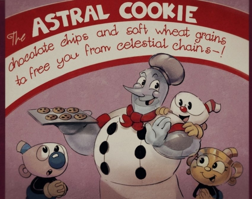
i made drafts for two 1930s-cookbook-style posters, because i thought that would be cool... here's the first one, finished and drowned in filters. the text is a bit conspicuous (lettering is historically not my strongpoint) but i think this was an overall success given that my rendering hasn't been great recently and i rarely do lineart (typically i just color sketches)

There are no comments.
Login to respond »