Description
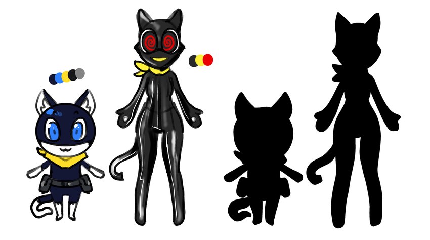
I can't find the source for this image other than the /v/ thread it was posted to, so I have to assume the poster is the one who drew it. Here's their thoughts on Morgana's official and Beta designs:
I study character design and it’s all about color and silhouette. Morgana has dark blue, light blue, yellow, and grays. Which is appealing to the eye. The beta mona doesn’t have a bad palette, but it uses it poorly. Ryuji has the same palette but manages to look good with it because it’s balanced. He uses browns and greys to add variety. Also looking at the silhouette, normal mona just looks more interesting. With his utility belt, stubby appendages, long tail, and balloon head. Concept Mona just looks like a generic cat girl. It has a skin tight suit like Ann but doesn’t have the high boots or gloves to make it interesting.
There are no comments.
Login to respond »