Dec 1st: If your account has been hit in the most recent ban wave of compromised accounts please reach out to us at management[at]e621.net and we'll help you get your account back.
If you've already contacted us give us a moment to get to you, though if it takes longer than a day for us to get back to you do feel free to reach out again!
Dec 2nd: If you got got and suddenly aren't able to see any of our exquisite selection of sausage and taco posts double check that Safe Mode is disabled in your account settings (Account -> Settings -> Safe mode [right above the blacklist text box]).
Oct 24th: Did you know that as of this news update, 30.8k posts have been uploaded by 5.2k verified artists? Read our Artist Verification page to learn how to get faster approvals and a verified checkmark on your posts.
We still have a Discord server, come talk to us!
Want to advertise on e621? Click here!
Are you an artist uploading your own art to e621? Get verified now!

You must be over the age of 18 and agree to the terms of service to access this page.
By default a limited blacklist has been applied hiding content that is commonly objected to. You may remove items from this blacklist by using the blacklist menu item.
Danjen
MemberGood gosh
cellidor
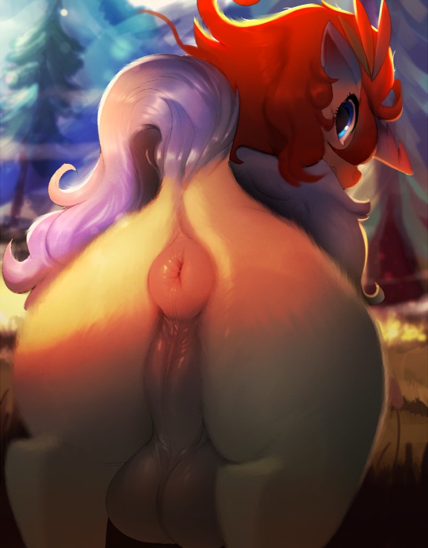
MemberGod -damn-. That is one -fine- keldeo booty!
batbean
Member<3
Zangoose
Memberfat balls and a perfect donut - best keldeo picture ever, glad he finally got more porn justice ~ love his taint too <3
sl
MemberThose balls look so full, shame we can't see if their cock us leaking.
Keldeo
MemberIt's ridiculous that I'm the one with the criticism here, but the dock (base part of the tail) is throwing me off for this one. I think what's bugging me is that the color of the coat extends too far up, so that it looks more like the skin of the butt has been pulled up into a sort of knot to which the tail has been stuck onto, making it look kind of unnatural?
It could just be a perspective trick, but (I know this is a completely different angle) if you compare it to this anatomical piece you can see how in that the hair of the tail seems to reach the very base of the rear for the most part, whereas on this it's more like the base of the rear is pulled up and out instead with the tail being set atop that pulled out knot. It gives the behind kind of an awkward shape if you see it like that, and I can't get over it.
I can't really put art into words, so I apologize if that doesn't make any sense. I wish I liked this more than I do.
LunarMarshmallow
MemberoH! yeah you're totally right haha.
i guess i was trying to go overboard with making it stylistic but it ended up lookin weird.
thank you for the feedback <3
Keldeo
MemberWell someone can't take criticism even when the artist agreed.
Login to respond »