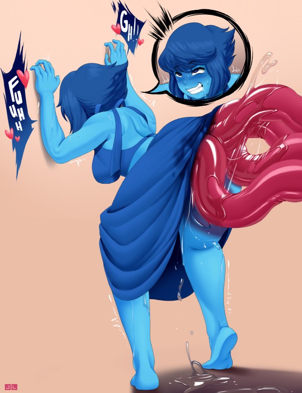
 elemental_creature elemental_humanoid eye_roll female forced from_behind_position fucked_silly gem_(species) hair hi_res humanoid jlullaby lapis_lazuli_(gem_species) lapis_lazuli_(steven_universe) not_furry penetration rape restrained sex simple_background solo spread_legs spreading steven_universe tears tentacle_penetration tentacle_rape tentacle_sex tentacles threaded_by_tentacle")
↑350♥1227C1
Lapis Lazuli ATWT 1/2
MY PATREON
i was experiementing a bit with no necessarily new methods, but new presets on this one! I've mentioned beforehand that i was trying to find a better way to blend my shades/highlights and the only way to do that was merge the base colors for more control on the colors. However i discovered something called DPI/PPI when finding ways to make the blending more efficient by changing it from 72 to 300. I know it affects the resolution or something when printing but i actually don't know if it actually does help with the canvas itself x) from testing it however, i felt more control but that could be of course my brain tricking me into believing it lol when nothing has changed at all.
Another test i tried doing was providing more color theory to my pictures. In this piece, since i knew Lapis was going to be a strong set of blue colors, i had to avoid some monochromatic sets. i tried complementary which looked good, however the colors were too strong to focus on lapis. So at the end, i went with compound colors with some desaturations of course to contrast with how saturated Lapis' color palette is. I personally liked how the colors turned out, especially since i have trouble with characters with an extreme color saturation to them.
Awjj the watertype
Memberwheres her gem?
It's supposed to be in the crook of her back
Jagoff
MemberTrue, true
Login to respond »