Description
Kathrin's Introduction
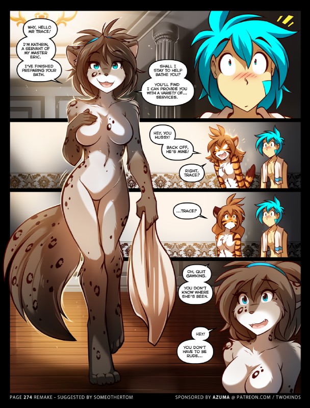
Now in color, thanks to our Nora Card sponsor Azuma!
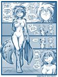
This is a remake of page 274, drawn as if it were made today! I had a lot of fun revising this scene. I wouldn't mind revisiting more scenes from the past - though a whole page is perhaps a little too much. XD It's a lot of work.
I still think the original page has its own charm - something that's not entirely possible to completely recapture. It's a nostalgic snapshot in time, and I don't blame anyone if they say they prefer the simpler style. ^^ Still, I hope you appreciate seeing a more modern take on Kat's first appearance.
Only Kat:
Nude edit: https://i.ibb.co/f0fBNz2/i.png

Whitewolfdog
MemberI can only get so hard! Kat is so cute and sexy in this one.
ChatNoir91
MemberNever before realized Kat can be so, distracting....
That walk with the tail swinging to and fro, it's no wonder trace is hunched and only the upper body is shown.
Iago1
MemberIf this, of all things, doesn't get an edit...
Samkyo
MemberThe color makes the whole scene a lot better. I love it
Neonetik
MemberIt's truly remarkable just how much this person's artwork has improved, and I don't even consider the original picture to be poor at all. Guess that's what drawing for like 20 years straight does to ya!
rzaku
MemberHello there
Zephyr W
MemberMakes me glad I saved the ORIGINAL originals, because the comic page linked was, like several others, edited by Tom at some point to remove more explicit imagery. In the original, Kat's groin had an indentation and a splash of pink.
SamusAranFox
MemberI think Tom fischbach's art is one of the few where find the art sexier without the naughty bits. I almost prefer it this way.
Darkgurd
MemberI mean even the way she's putting her hand on her chest is so damn hot
Kirioso
MemberThis is the body I know Kat for, really wish she still looked like this. She's way more lean and petite now...
Login to respond »