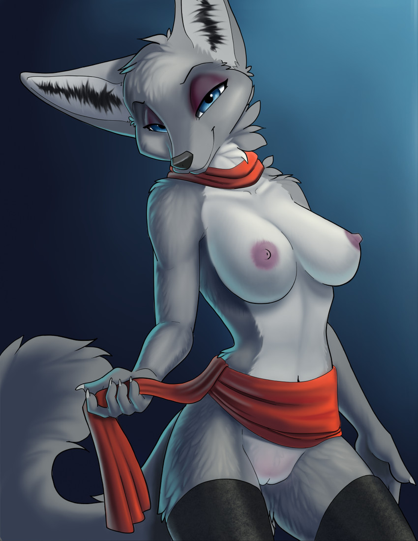
Description
Because that was my WIP name for the file as I was working on this, and I might as well stick to it.
I wanted to set aside some time today to screw around with proper digital colouring, shading and all. Most of my technique from traditional painting doesn't translate to digital art very well, so I was pretty much flying blind on how to best go about things.
As a result, this is pretty terrible. I don't like the style at all, it's very flat and smudgy and boring looking. If I decide digital colouring is something I want to get into in a serious way I'll have a lot of studying and experimenting to do to find a method and style of painting that I like. But it was my first go, so I didn't expect greatness here. For a first go, this'll do fine I guess, hah.
Epantsimator
MemberI can see where you're coming from, but for a first try it's far from bad. The only major weakness is the ears.
Deored
Member"this is pretty terrible"
Is amazing what artists consider "terrible."
No-one-you-know
MemberEveryone’s greatest critic is themselves
ubaresc
MemberThe biggest complaint I have with this piece is the texturing of her stockings, it looks like matte black polyester, which just feels too shiny in a strangely wrong way
user 272767
MemberHoly crap, Ruaidri. You've done a great job here! I've struggled with turning traditional painting skills toward digital ones, as well. I'll be honest -- one reason (among many) that I've always loved your work is that it is in a traditional medium. I encourage you to keep going with digital, but I adore your watercolors and hope you won't stop doing them!
TheDarkWyrm
MemberThis is a classic "my cake is so much worse than the cake this other person made" vs. "holy shit, two cakes!" moment. This is really good.
Jesirawr
MemberI think the artist would be happier if they made the linework blend into the rest of the painting better.
Login to respond »