Dec 1st: If your account has been hit in the most recent ban wave of compromised accounts please reach out to us at management[at]e621.net and we'll help you get your account back.
If you've already contacted us give us a moment to get to you, though if it takes longer than a day for us to get back to you do feel free to reach out again!
Dec 2nd: If you got got and suddenly aren't able to see any of our exquisite selection of sausage and taco posts double check that Safe Mode is disabled in your account settings (Account -> Settings -> Safe mode [right above the blacklist text box]).
Oct 24th: Did you know that as of this news update, 30.8k posts have been uploaded by 5.2k verified artists? Read our Artist Verification page to learn how to get faster approvals and a verified checkmark on your posts.
We still have a Discord server, come talk to us!
Want to advertise on e621? Click here!
Are you an artist uploading your own art to e621? Get verified now!

You must be over the age of 18 and agree to the terms of service to access this page.
By default a limited blacklist has been applied hiding content that is commonly objected to. You may remove items from this blacklist by using the blacklist menu item.
BDubs
MemberEveryone loves a hot nerd
anon4335
Memberoh my god yessss
DracosBlackwing
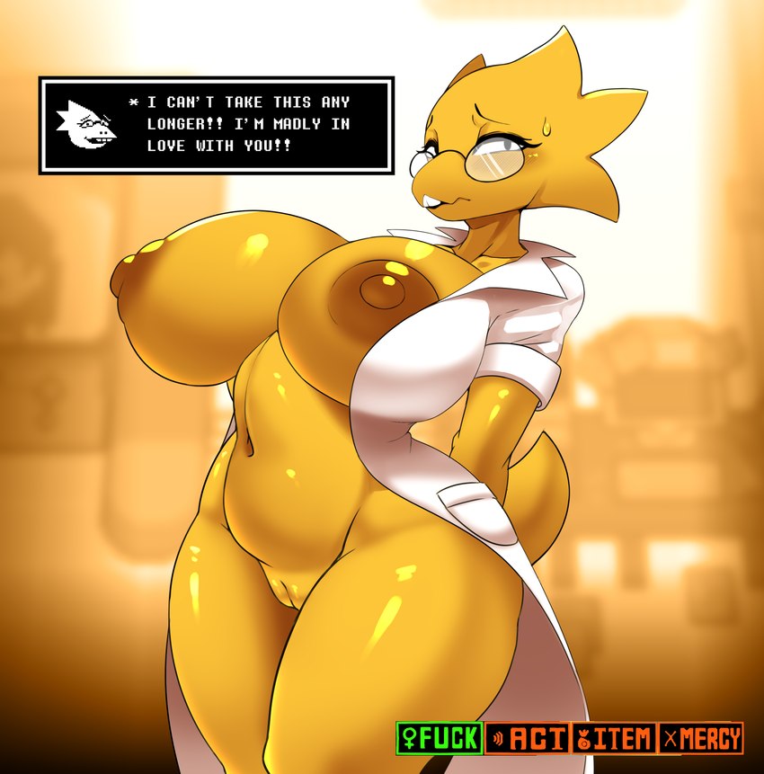
BlockedHer head and neck seem more than a bit overly offset from the rest of her body here. There would have to be a pretty sharp angle to her spine near the shoulder blades for it to be back that far compared to the rest of her body's position.
I get they were trying to accentuate the size of the chest, but still.
ConfusedWaterDemon
MemberThis design for Alphys is quite unique. I like it.
Login to respond »