You must be over the age of 18 and agree
to the terms of service to access this page.
By default a limited blacklist has been applied hiding content that is commonly objected to. You may remove
items from this blacklist by using the blacklist menu item.
Absolut
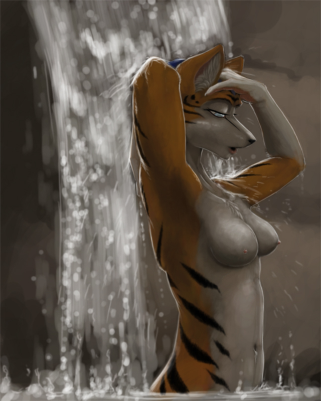
BlockedBeautiful in a sense, but it seems to me like it's more of skin painting rather than fur other than the tuff on the chest and inside the ears. The water has a specific reaction to fur, I guess it should show it.
bella
Memberfor the type of art it is, the details were captured amazingly. the fur is shown by the brushy edges of the stripes, you have to take into account dificulty of the way its created to fully understand the beauty of it, i personaly give it a 10/10
Anonym
MemberThis is why you're not a critic. By giving it an arbitrary score like 10/10, you belittle everything better that came before it or will come after it. Why do the breasts look like cones jutting from her chest at odd angles? The nipples don't seem to know where they want to be
And this is coming from someone that never comments on facial styles -- The face is just fugly. If you're going to heavily stylize your character's face, for cripes sake man, <em>huge overbite</em> is <em>not</em> the way to go.
I see what they were trying to do with the back but it didn't work; It looks lumpy. The neck also looks deformed.
The shading is good. I'll give them that. That's gotta be worth points. While we're giving arbitrary scores...Let's see...Bad anatomical choices. -10. Bad face. -1. Lazy background. -1. Good shading. +12.
*mentally adds* Looks like this pic gets an <em>> 9000</em> out of ten.
zot
MemberI think it's sexy.
Joan
MemberThe breasts look fine, the face is fine, the back and neck are fine. And you, possibly-mister, are whining about rather good art just because someone happened to give it 10/10, which you take a philosophical objection to. Live with it :P Like Zot said. Sexy.
WolfieWolfie1992
BlockedI hate it when people argue on the Internet, trying to see which one is smarter...
WolfieWolfie1992
BlockedWhat?!? 9,000? IT'S OVER NINE THOUSAND!
KaylinKumiho
MemberIn the end, they are both idiots. The truly smart people don't get involved.
Anonym
MemberIrony alert!
Crokotron
Memberehh.. i would give it a 7/10
the face looks fine, and same with the breasts, but i DO have to agree with you on the bumpy back and the nomadic nipples
Login to respond »