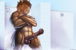
chance (bad dragon) created by narse
Viewing sample resized to 85% of original (view original) Loading...
Children: 2 children (learn more) show »
Blacklisted
  • Comments
  • Oh, I get to complain about this image in full now~!

    1) Inconsistent shading. His head looks completely different from his body.
    2) The tip isn't bulged in the slightest.
    3) The medial ring is 3/4'ths the way up his cock.
    4) For an athlete, he sure has gotten pudgy.
    5) The tiles have no consistent depth. It's like an M.C. Escher up in here.
    6) Magical blur at the base of his cock.

    Normally, I'd just ignore an image like this. But on a website like Bad-Dragon, using this as a promotional image for a product that can cost upwards of $260, I'd honestly expect better.

  • Reply
  • |
  • 12
  • Sofi said:
    Oh, I get to complain about this image in full now~!

    1) Inconsistent shading. His head looks completely different from his body.
    2) The tip isn't bulged in the slightest.
    3) The medial ring is 3/4'ths the way up his cock.
    4) For an athlete, he sure has gotten pudgy.
    5) The tiles have no consistent depth. It's like an M.C. Escher up in here.
    6) Magical blur at the base of his cock.

    Normally, I'd just ignore an image like this. But on a website like Bad-Dragon, using this as a promotional image for a product that can cost upwards of $260, I'd honestly expect better.

    Although I agree with the rest of your points, how is he in any shape pudgy? He's thick, but that's definitely not from fat.

  • Reply
  • |
  • 3
  • SynxTheLynx said:
    Although I agree with the rest of your points, how is he in any shape pudgy? He's thick, but that's definitely not from fat.

    His abs look to be heavily out of proportion; it makes him look a bit more chunky than built, at least from what I saw in Sofi's points... for a stallion that is supposed to be drawn as athletic I feel this is a pretty big error, especially considering this is supposed to be a promo image.

  • Reply
  • |
  • 0
  • SynxTheLynx said:
    Although I agree with the rest of your points, how is he in any shape pudgy? He's thick, but that's definitely not from fat.

    I just think he looks chunky. The original Chance had a lean body and strong legs. This one just looks like he eats steroids and protein shakes.

  • Reply
  • |
  • 0
  • SynxTheLynx said:
    Although I agree with the rest of your points, how is he in any shape pudgy? He's thick, but that's definitely not from fat.

    As a clarifying point, pudgy =/= fat

    But I also wouldn't describe him as 'athletic' since he's portrayed as a runner. He looks more jock-ish than athletic.

  • Reply
  • |
  • 1
  • Sofi said:
    Oh, I get to complain about this image in full now~!

    1) Inconsistent shading. His head looks completely different from his body.
    2) The tip isn't bulged in the slightest.
    3) The medial ring is 3/4'ths the way up his cock.
    4) For an athlete, he sure has gotten pudgy.
    5) The tiles have no consistent depth. It's like an M.C. Escher up in here.
    6) Magical blur at the base of his cock.

    Normally, I'd just ignore an image like this. But on a website like Bad-Dragon, using this as a promotional image for a product that can cost upwards of $260, I'd honestly expect better.

    The only excuse I can think of for the first one, is that the water is magical shading water. I mean really, his head is the only thing dry and that seems to be the problem.

  • Reply
  • |
  • 0
  • Goodmoon said:
    The only excuse I can think of for the first one, is that the water is magical shading water. I mean really, his head is the only thing dry and that seems to be the problem.

    Or it could be that when hair gets wet it turns darker than normal. My hair is darkish brown but when it gets wet it looks black.

  • Reply
  • |
  • 1
  • Sofi said:
    Oh, I get to complain about this image in full now~!

    1) Inconsistent shading. His head looks completely different from his body.
    2) The tip isn't bulged in the slightest.
    3) The medial ring is 3/4'ths the way up his cock.
    4) For an athlete, he sure has gotten pudgy.
    5) The tiles have no consistent depth. It's like an M.C. Escher up in here.
    6) Magical blur at the base of his cock.

    Normally, I'd just ignore an image like this. But on a website like Bad-Dragon, using this as a promotional image for a product that can cost upwards of $260, I'd honestly expect better.

    I never thought I'd see it.

    Actually constructive criticism on e621

  • Reply
  • |
  • 0