Dec 1st: If your account has been hit in the most recent ban wave of compromised accounts please reach out to us at management[at]e621.net and we'll help you get your account back.
If you've already contacted us give us a moment to get to you, though if it takes longer than a day for us to get back to you do feel free to reach out again!
Dec 2nd: If you got got and suddenly aren't able to see any of our exquisite selection of sausage and taco posts double check that Safe Mode is disabled in your account settings (Account -> Settings -> Safe mode [right above the blacklist text box]).
Oct 24th: Did you know that as of this news update, 30.8k posts have been uploaded by 5.2k verified artists? Read our Artist Verification page to learn how to get faster approvals and a verified checkmark on your posts.
We still have a Discord server, come talk to us!
Want to advertise on e621? Click here!
Are you an artist uploading your own art to e621? Get verified now!

Azphel
MemberShe is lovely.
Jugofthat
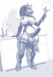
MemberSweet coloring job, although I do think a bit more contrast in the colors used wouldn't hurt, even small differences in tone between the various attributes could help. There's a bit too much dark chocolate brown in there, to the point where her outfit and skin start visually blending together, and because the only alternative (besides the also brownish 'white' skin) seems to be an even darker brown, her facial features in particular get quite muddled, just look at those eyelids and compare them to the original.
The head of her cock suffers the same fate, since there's almost no way to distinguish the pure black lineart from the colored areas if they clash directly, so the urethra almost disappears. And I'm sure this can't all just be blamed on my monitor, since it has a VA panel that should excel at blacks and contrasts.
That having been said though, from a technical point of view it's still fine work. Good shading (a real improvement over the original around the crotch), good use of highlights on places like the nose (though on the latex, the monochrome one needed to exaggerate them and this could be toned down a little here with some gradients).
And speaking about gradients, I like what you did with those breasts. While Wolfy-Nail did a surpringly good job giving them depth perception for a monochrome drawing, they still have more of it here, which is exactly what coloring should do.
---
Yeah... I actually don't know why I'm going all art critic all of a sudden, but hope it helps Wingr should he read this. :P
Daletfours
Member9.5/10 It's ok. -IGN
FwP
MemberGotta go to hotel.
cornhaggle
MemberI want me some of that.
BangBear
MemberLooks like a chocolate zebra.
Elegon
MemberI would like to see it colored B&W
Elegon
MemberBut plus to creativity
Jugofthat
Memberpost #521932
Magic!
Jack-Redgaze
MemberYes aaand... yes.
Login to respond »