You must be over the age of 18 and agree
to the terms of service to access this page.
By default a limited blacklist has been applied hiding content that is commonly objected to. You may remove
items from this blacklist by using the blacklist menu item.

Zume
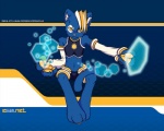
MemberThis is freaking awesome! :D
dude1982
Memberhardblush wants its design back.
thedxm
Blockedfantastic
Evangel
MemberBulge.
EmergencyAirdrop
Membervery sexy~
jasmin
Blockedim glad this wasnt the main winner
Cache
MemberMy first thought as well.
My bookmark links to the login page, so I probably won't see any of the mascots. Not that it bothers me either way.
Nasticus
MemberI love you Hexerade!
jasmin
Blockedthe mascots will be all over the website, not just the front page, although e6 is the front page. im all ready to adblock this ones images. although my bookmark takes me directly to posts
SapperDragon
MemberNope, but it will still feature on the damn website. Good bye clean and simple design. <3 Hello pointless bandwidth utilization!
Riversyde
MemberI hope it is possible to keep a link to e621 2.1 so people who dont want all the flashy stuff can use that instead.
Kitsu~
BlockedThe only time I ever visit the front page is to see how many posts e621 has, aside from this functionality it is entirely useless.
Fox2K9
MemberYup. Just like me.
Also chizi sure can draw.
My only complain is his pants...
nme22
Memberreminds me of the king of the universe from "Katamari"
[GER]ray
BlockedThat looks soooo cool chizi :D
♥ Hexi ♥
I hope you just ignore those haters chizi =)
jasmin
Blockedlets face it, a character like that being a mascot of a wide range of fetishes was going to garner some criticism and hatred, no doubt about it, just because a lot of people like it doesn't mean everyone does, and those are going to be verbal about it :V still, its not a bad style, just a boner killing idea
Valaska
MemberI like the chick one
Burninghart
MemberIf it weren't for the bulge, then this would be absolutely perfect.
I mean, as it is, with those skimpy clothes, he's got some kinda sex appeal (as must be needed for an e621 mascot), but the bulge is honestly a bit much. It's generally unneccessary(might've spelled that wrong) and detracts from the quality of the piece.
Save bulges for comical renditions of guys getting turned on by something, people. That's when they're honestly best used.
baracudaboy
MemberNo, not even a little bit.
King of Hunters
Member*sets as Bg* :3
WolfieWolfie1992
BlockedJust be thankful that that insect one didn't win...
(no offense)
furfag
Blocked*background image set*
user 8690
MemberDAT BULGE!!
And I don't mean that in a good way.
darkestspirit
Memberdeffinitive YES !!! win win XD
thedxm
Blockedbulges are sexy and awesome, btw chiz, keep up the good work! ^^
SimperinFool
MemberDoubleplus yes.
SapperDragon
MemberGod damn it, you have no idea how right you are.
This one's nice, clean, simple and lovable. The blue theme, that visit counter made of awesome icons. <3
Foxy-Fluffs
MemberAwful....just awful
Chemico
Blockedless cockbulge plz
chizi
Membercare to elaborate?
TheFrozenOne
MemberThis is awesome...
SyntaxErrors
MemberAbsolutely love this character.
Wonderful job Chizi.
I'll probably find myself coming back hourly to check for more pics of him. xD
Oh, btw.
MOAR BULGE
Kthx.
HurpDeDurp
Blockedneeds a macro version c.c
NeverendingTwilight
MemberLate to the party, but eh. This is quite an amazing image and I have no idea what all the bitching is about. Complaining about a bulge? Really? Geeze, no wonder we furries are hated so much. We complain about the most trivial things.
4channyGranny
Blockedmeh
TheFictitiousFox
MemberI'd love to get a pawjob from those.
Login to respond »