Dec 1st: If your account has been hit in the most recent ban wave of compromised accounts please reach out to us at management[at]e621.net and we'll help you get your account back.
If you've already contacted us give us a moment to get to you, though if it takes longer than a day for us to get back to you do feel free to reach out again!
Dec 2nd: If you got got and suddenly aren't able to see any of our exquisite selection of sausage and taco posts double check that Safe Mode is disabled in your account settings (Account -> Settings -> Safe mode [right above the blacklist text box]).
Oct 24th: Did you know that as of this news update, 30.8k posts have been uploaded by 5.2k verified artists? Read our Artist Verification page to learn how to get faster approvals and a verified checkmark on your posts.
We still have a Discord server, come talk to us!
Want to advertise on e621? Click here!
Are you an artist uploading your own art to e621? Get verified now!

You must be over the age of 18 and agree to the terms of service to access this page.
By default a limited blacklist has been applied hiding content that is commonly objected to. You may remove items from this blacklist by using the blacklist menu item.
Roy McCloud
MemberF.A.I.L!!!
Battle Fennec
MemberCould do better, you know...
Illuminatii
MemberWhat needs fixing??
EinTheCorgi
Memberehh i kinda like :/
Roy McCloud
MemberEVERYTHING, this is just...NO!
Illuminatii
Member|:/ Doesn't exactly help.
Inominata
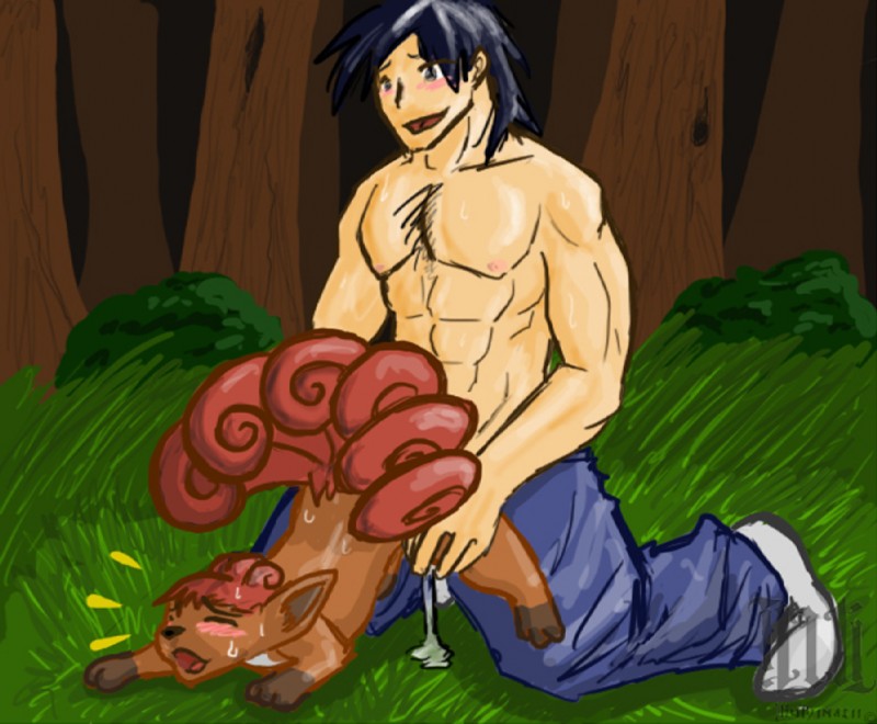
MemberStart with the faces, they look kinda... flat... next the dude's back part of the head looks kinda weird, even though I can't put my finger on it... then you could do the hair more detailed, same with the background, lastly make more distinguished shadows on the characters...
eqgz
MemberYou're drawing the rough outlines of shapes rather than understanding the volume of them. Thinking in 2D makes everything you draw seem flat and unconvincing.
Get a book on basic drawing and anatomy and pay attention to the "cone, box, and cylinder" shapes in the construction of forms.
Illuminatii
MemberThanks for the advice
eqgz
MemberYou're welcome.
redweasel
Memberhis face is like "hey this actually feels pretty good!"
this has better dimensions than most people ever draw in their life. human faces are supposed to be kinda flat anyway. your real problem is that the human's head is too small. remember that the eyes only go up half of the head's height and fill out foreheads fully. it's an egg shape, not a pot with hair on it.
his hips need more definition. not like girly, but it looks like his pants are levitating like 2 inches away from his butt.
might want to zoom out some more. the picture would look better with a static border, though you would lose some of the interesting negative spaces the man and vulpix cut out.
Illuminatii
MemberStatic border? You mean one that imitates the shape of their bodies?
DoctorDragon
MemberWhat the heck is wrong with you people? It's fricken art!
DagDaWildDog
MemberThey are being overly harsh... I think the artist did pretty well~
SolTheBraixen
MemberY e s
Login to respond »