Jan 7th: Small update to the Uploading Guidelines today: We now no longer allow paintovers of AI generated content. Or in other words AI generated content that has been edited to some degree by humans.
Dec 1st: If your account has been hit in the most recent ban wave of compromised accounts please reach out to us at management[at]e621.net and we'll help you get your account back.
If you've already contacted us give us a moment to get to you, though if it takes longer than a day for us to get back to you do feel free to reach out again!
Dec 2nd: If you got got and suddenly aren't able to see any of our exquisite selection of sausage and taco posts double check that Safe Mode is disabled in your account settings (Account -> Settings -> Safe mode [right above the blacklist text box]).
We still have a Discord server, come talk to us!
Want to advertise on e621? Click here!
Are you an artist uploading your own art to e621? Get verified now!

Song
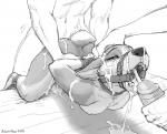
JanitorI'm all for edits, provided the artist has been asked for permission in advance (and sees the final project before it's posted), but I'm not too fond of some of the choices in this one. I'm not an artist myself, but I can still offer some critique and opinions on what would make this look better:
1. Not too keen on the stark contrast of red and blue for the sheets and background, respectively. It's a little jarring to the eye and could be swapped for a different palette or be more muted.
2. The areas where colors blend on the bound girl look strange. Multicolored fur tends to possess some degree of irregularity to it where the colors mesh, which can be conveyed by using jaggedness in the linework (see the right thigh and arm on the original) or should be kept distinct (see the forehead on the sketch, as well as post #548547, which keeps fur colors cleanly separated and just uses shading atop that).
3. White and red nipples. Probably should have colored those and the surrounding areolae pinkish.
Not much and not in great detail, but it's hopefully constructive despite.
kaolin
Member#1. I understand the contrast, I was just in a bit of a hurry to finish. :P (red sheets, blue walls, white... stuff, she's just being patriotic )
#2. Colour blending is hard, especially when the original image has some shading on it where the colours are going to be.
#3. yea... I missed that...shit...
THANKS FOR THE FEEDBACK!
user 71813
MemberThis coloured version looks amazing-great choices, it really sets this hot piece off.
Foxsye
MemberSomething seems off here..
kaolin
MemberI'm looking to do more if anyone has a pic they want coloured
I DON"T DO:
*male solo
*male/male
*chubby
*scat/watersport
*equine/MLP
PentiPuss
MemberThat file size is pretty suspicious....
kaolin
Member>_>
<_<
move along... I'm not evil
thecooler
Membersome one did a color version of an sketch edit I did long ago and got flag and deleted for it! now some one repost it and then some one else colored it. and its here now WOW! I was just a cringy fan of this artist and did some crappy editions changing the males on it for females. I never thought this would happen. XD the parent of this images is actually an edition!! my mind is blown!. XD the male version is the original one!. XD
Login to respond »