
↑29♥40C7
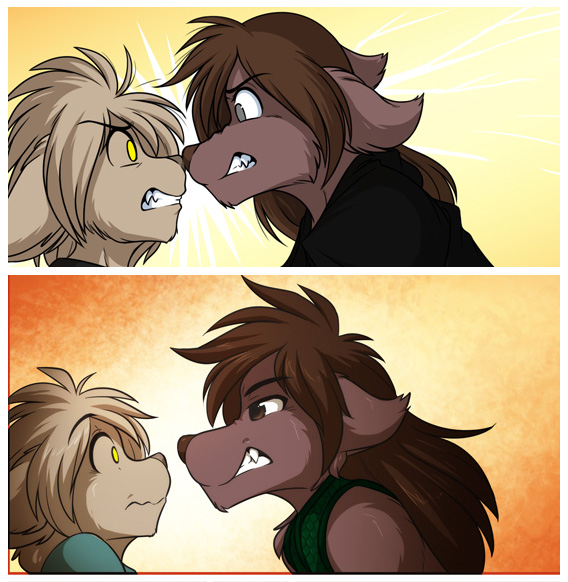
Natani vs Keith Comparison
This was not intentionally, but a few fans noticed the similarities, so I went ahead and made a comparison. The top one was drawn in 2013 while the bottom is 2014. It's interesting how much can change in just a year. Natani especially. Changes in style aren't something I have much control over, it's just a natural result of drawing over time. Whether the changes are good or bad is a matter of opinion, and everyone will feel differently. But I hope, regardless of what the characters look like, you'll still enjoy the story. :)
~Tom Fischbach
Bottom original
post #576366
Lvovich
MemberI for one absolutely love the way 2kinds is developing and love seeing the relationship between these two bloom. The art is getting crazily good and I commend Tom for keeping up the schedule he's been doing with the quality of work he's putting out.
Blackphantom770
Blocked^ Agreed
2tailed fox
MemberLarger muzzle makes Natani look more dominating, which I like. I've also enjoyed how Keith has simmered down throughout time...more easy going, come to terms with his life and such. If you're losing fans over such minuscule things, they're not much of a fan to begin with. Keep doing what you're doing, don't loose sight.
Reian
MemberTom's art and storytelling has most definitely improved over the years. I eagerly look forward to whatever direction the comic takes. <3
Derpy Whooves
MemberI like the new hair styles and later more defined pupils
westlab
MemberI covered the part of natani's mouth with her teeth showing and that just made it look like Kieth was in even more trouble... A very different kind of trouble
Login to respond »